

lighthouse Brand Identity
lighthouse | 2023
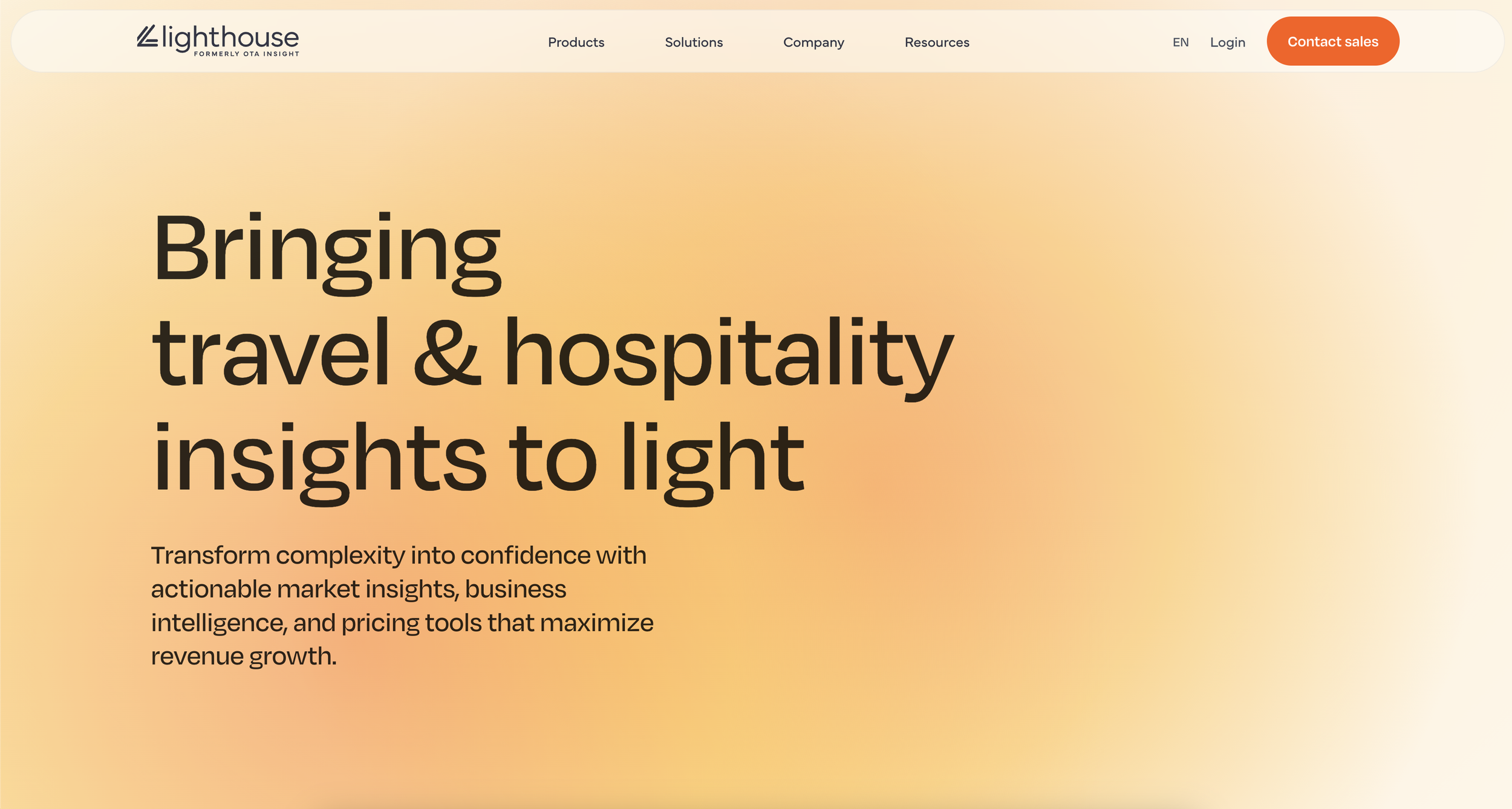
Sight rebranded to Lighthouse, setting out to carve a more distinctive presence within the travel and hospitality industry. Inspired by the act of searching for a landing in the dark, the identity leans into clarity, guidance, and moments of illumination. The result is a system that reflects Lighthouse’s role in helping hotels navigate data with confidence and precision.
SCOPE
Art Director
Brand Designer
Logo Story
The logo is a visual cue of the Lighthouse brand story. The data stream icon is made up of three shapes designed to symbolize a change in perspective through light refracting off of a surface and a continuous flow of data. The logotype is set in lowercase for an approachable modern feel.


Gradients
Gradients must represent light rays and therefore show the general direction of light or light reflection. This effect is created using radial gradients or constructed using circles in solid colors with a layer blur effect applied.

Team
Andrew Miller | Creative Director
Calvin Lyte | Creative Director
Emily Galvelis | Art Director